There’s a lot of large companies in the United States alone. Over 20,000 employ 500+ employees, per the US Census Bureau’s latest available data.
After reading more into Google’s Core Web Vitals, seeing chatter from the SEO industry on LinkedIn, and having read and referenced FreshChalk’s small business website teardown in the past, I began to get ideas.
So, I wondered: How’s some of the largest company’s digital presences? What are their average load times and are they setup to succeed with Google’s new Core Web Vitals?
I decided to start with a manageable project and see where it took me. And so: I honed in on the Fortune 100 and on their homepages.
Why the homepage? Considering such large companies have massive brand presences in their sectors, I thought a small step like this could prove useful … and the data was just as interesting as I’d hoped.
One quick caveat: This is not intended to throw stones. Managing large sites is quite difficult, and I honed in on only one small part of it. In fact, for many of these companies, their homepage experience may not even matter much in a buyer’s journey!
Click to jump to a section, and if you want to see something else or have questions, don’t hesitate to reach out to me on LinkedIn or our contact page!
I also uploaded the data I compiled into a publicly-available Google Spreadsheet. Click here if you want to see it while reading.
Methodology | Why Should I Care? | Executive Summary | What They Do Well | What They Do Poorly | Other Observations | Conclusion
Methodology
Companies were examined in order as they appeared on the 2020 version of the Fortune 500 list.
Industry designations were also used from this list, though I only used designations with 2+ companies that had the same – otherwise, they were lumped into an “Other” category. I did take a few liberties to try and simplify this, such as putting CVS Health into “Food & Drug” since it’s a competitor of Walgreens.
I simply entered the company into Google, and grabbed their homepage. For a few sites, I instead used the site that ranked highest for their brand term after confirming the more customer-facing site. For example, Berkshire Hathaway’s main site is something to behold, but then again nobody cares about the holding company. So instead, I used what was highest in Google’s search, Berkshire Hathaway Home Services, in this data.
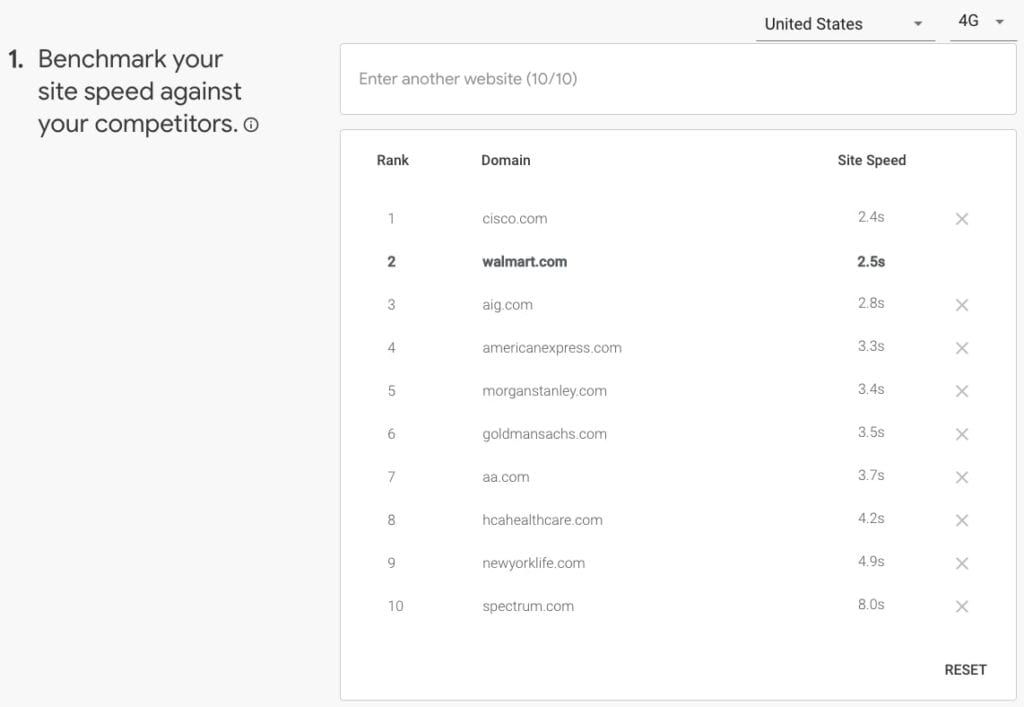
To start, I used Think With Google’s Test My Site tool which focused on speed ratings from a mobile perspective, set to United States on 4G network. This uses real-world reporting from the Chrome User Experience report.
Then, I ran each through Google’s PageSpeed Insights tool, focusing on core metrics + what the top “opportunity” was to see what trends might come up in both mobile and desktop. All 100 sites were run through on the same day so the field data covered the same date range.
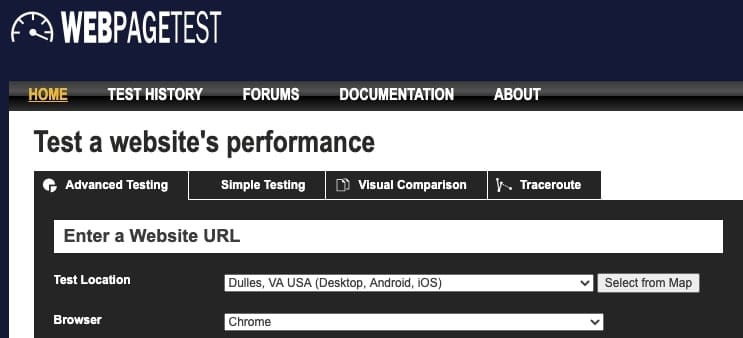
Next, I used WebPageTest to take a closer look, using the default settings of Dulles, VA, USA (Desktop, Android, IOS) and with three test runs. (Also, I humbly apologize if you were stuck in the queue waiting on me to finish.)
Finally, I did to a few re-tests when something seemed awry (i.e. a site took 5x longer to load than the norm, which happened a couple of times) just to ensure it wasn’t a blip. WebPageTests were completed on two separate days within a week of each other.
If a site could not be run for whatever reason (here’s one example), it was simply skipped from that dataset.
Side note: If you run a similar test, you won’t get the same numbers I do. Companies change sites, servers run fast / slow at different times, and even the testing tools can impact results. This is a simple snapshot!
Why should I care?
Because revenue is on the line!

There is plenty of other research to support this, as well: Faster sites help improve your inbound lead generation efforts.
Consider this, from CloudFlare:
- Walmart found that for every 1 second improvement in page load time, conversions increased by 2%
- COOK increased conversions by 7% by reducing page load time by 0.85 seconds
- Mobify found that each 100ms improvement in their homepage’s load time resulted in a 1.11% increase in conversion
That’s just the on-site experience, but speed is also an important ranking factor in SEO and can help you gain an edge over competitors when you’re trying to show higher for key terms. In fact, it’s been important since 2010 when Google told us so.
In competitive industries, every little bit matters to driving greater revenue – and having one of the slowest websites can be particularly damaging.
Executive Summary
You can get the main ideas here, but to learn more details you’ll want to keep scrolling!
Related: 3,500+ words on how to win in a cookieless advertising world
86% of Fortune 100 sites rated as “slow” or “needs improvement” in Google’s mobile test
This is defined as taking longer than 2.5 seconds to begin loading, and this data is based on real-world data aggregated from Chrome browsers.
The average load time was 3.55 seconds, nearly a full second longer than what’s considered “good”
- The fastest (all under 2s): HP, FedEx, AmerisourceBergen, Amazon, Alphabet
- The slowest (all above 6s): Spectrum (Charter Communications), Merck, Walgreens
Alphabet’s site has basically nothing on it, so that’s really an outlier. Amazon’s a known commodity, so I won’t focus much on them, either.
AmerisourceBergen had a pleasant design that hits many best practices for functionality, as well. There were still plenty of items to be found, so it wasn’t barebones by any stretch – but it shined above most of the others here and is worth you clicking over.
Broken down by industry:
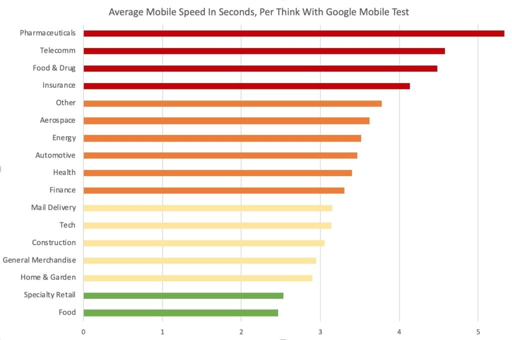
It’s perhaps not surprising that pharmaceuticals are slow – after all, these sites don’t really strike as primary gateways to major breakthroughs that’ll make their money, do they?
However, the insurance sector – which comprised 17% of the sites tested, easily the largest segment – surprised as being so slow. Half of the sites were greater than 4 seconds, with some not-insignificant disparities between direct competitors (Fast: Nationwide. Slow: Liberty Mutual)
In a market of billions, every little advantage adds up. And there’s opportunity on mobile to please customers more than competitors.
There is a trend of mobile lagging behind desktop
To be fair, this is one of those blanket statements you can apply to a lot of digital presences, but this ties into the previous statement.
First, a quick note on what these mean:
- First Contentful Paint (FCP): How long it takes for the first item to load that a user can see. In other words, how long until a person on your site knows its loading?
- Largest Contentful Paint (LCP): How long it takes to load the largest item on the page. Note, this could be background code instead of something that’s visible (image, text, video, etc.)
- PageSpeed Score: A simple, numeric value based on a host of factors in Google’s PageSpeed Insights tool. Higher is better, based on a scale out of 100.
And now, the discrepancy:
| Metric | Mobile | Desktop |
| First Contentful Paint (FCP) | 3.15 seconds | 2.25 seconds |
| Largest Contentful Paint (LCP) | 4.61 seconds | 3.78 seconds |
| PageSpeed Score | 25 | 61 |
Subjectively, some sites were far easier to navigate on mobile than desktop as well, from GDPR popups to button and text sizes.
If you’ve paid attention to SEO industry developments, you also probably noted averages for some Core Web Vitals listed above were in poor ranges. I’ll dive more into some of these later on in this post.
Most sites could do with less (code)
Less is more applies to many things, including web development. Simply put, the less code / data a user has to load, the lower (and better) average load times a site will have.
But the average WebPageTest had 136 total requests – that’s 136 different items / files (text, code, images, tracking pixels, etc.) a user’s browser has to load.
There is some correlation between less requests and shorter load times, too:
- 34 / 41 sites with less than 100 total requests had the homepage fully load in less than 10 seconds.
- 16 / 19 sites with 175+ requests fully loaded in 10+ seconds
Large / Heavy images are bad. And they’re everywhere.
More on this in the “What Fortune 100 Sites Did Poorly” section.
This doesn’t reference an image’s size in terms of length x width, but it does refer to its file size. Just like the point above with code, less = more because it speeds up the load times.
This is a basic on-page SEO item that was ignored far more often than anticipated.
What Fortune 100 Sites Do Well
A few had basically nothing on it, such as Alphabet’s site which is barebones. We can’t really glean too much from this except the aforementioned less is more, but other sites did provide some insights.
Despite loading 110+ different items (CSS, JavaScript, images, etc.), Coca Cola, USAA, Target, and Intel all had fast sites:
| Company | Homepage FCP | Fully Loaded | Total Requests |
| Coca-Cola | 0.96 | 6.643 | 163 |
| Intel | 0.677 | 5.151 | 112 |
| Target | 0.951 | 8.84 | 134 |
| USAA | 0.802 | 6.37 | 140 |
In addition, AmerisourceBergen, General Motors, General Electric, FedEx, Caterpillar, and World Fuel Services all had some strong metrics, albeit with less than 100 requests apiece.
So, what do they (and good aspects of many other sites) have in common?
No server delays
As a user, I would see the page loading close to a second after I’d typed in the URL. A typical person is impatient!
Faster sites started rendering sites quicker, and the server is the first point of contact in that process. Reducing the amount of files needed to load + having dedicated server space ensures a faster load.
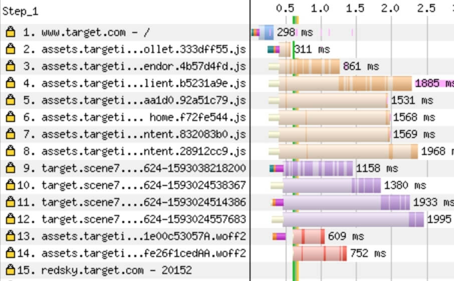
For instance, Target began loading in 0.7 seconds and only had 14 items begin loading before the page displayed items. Also note these loaded concurrently:
Using a CDN
Size, shape, and file type … all can be streamlined for great experience, and a Content Delivery Network (CDN) can certainly help with this. It’s not required for an optimal experience, but it can absolutely help for companies of many sizes.
In fact, “Serve images in next-gen formats” (such as WebP) rated as the top opportunity for improvement in PageSpeed Insights for nearly 30% of websites on both mobile and desktop.
Lazy loading
The those who don’t know, lazy loading enables any resource on a page to effectively “wait” until it’s needed to load. This helps speed up average load times and get your page on a person’s screen faster.
For example, in this post, you’ll notice there are images as you keep scrolling down. Until you scroll down, you don’t need to load them – they’re not on-screen! Lazy loading is what makes that happen, enabling the most important content (a.k.a. what you can see on your screen) to load faster / first.
I lost count of how many times I saw a bevy of JavaScript load before any text / images. Ideally, any code that isn’t necessary to get the page loaded / functional should be loaded later so a user sees the page loading faster on their device.
What Fortune 100 Sites Do Poorly
There were definitely some common themes.
So. Many. Large. Images.
This surprised me. It’s a basic tenet of maintaining a website: Keep images compressed and as little as possible while maintaining quality. But even some of the better-rating sites had issues.
More than half of sites had PNG files that could’ve had a JPG because the images didn’t require transparency. TJ Maxx had a homepage slider that is a great example.
CVS Health had a 13 MB file on its site that was live as of when this article’s publish date… and it was a JPG! I tested three different times on three different weeks just to be sure, and here’s the latest load time:

On a related note…
Largest Contentful Paint (LCP) times
How long does the largest image or text block that is visible to the user take to load? Good is less than 2.5 seconds, while poor is greater than 4.
The average LCP for all 99 sites I tested was 4.48 in WebPageTest.
This is part of Google’s Core Web Vitals, meaning it does have an impact on SEO ranks. While that’s probably not as much a concern for these homepages, other parts of the site could absolutely suffer because of similar metrics.
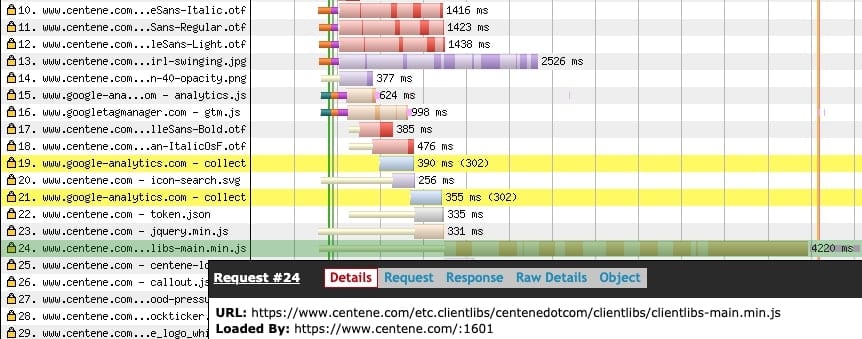
Large images were the primary cause of this, an easily-preventable issue. But some, like Centene, had longer-than-ideal load times for a variety of types. Here, you can see fonts taking 1+ second to load at the top, a large image, and the highlighted part of line 24 is a JavaScript library that was their largest item.
Finally, Archer Daniels Midland had a couple of examples: Video (note the .mp4 at the top) and web fonts (all of the .woff2). While they did load after the page began showing up (denoted by the green vertical line), these are some large payloads for any browser.

Carousels are apparently still a thing. Why?
Change management is slow, and even slower in larger organizations. How’s this apply to carousels, you ask?
Because I saw over a dozen sites still with them, despite being well-known they aren’t very customer-centric at all.
They’re big, they’re slow, and nobody reads anything past slide two (and usually not even that). If you have one or simply think otherwise, click right here and scroll through it. Also, check out this 2017 article from Yoast or this more recent CXL article.

Carousels / sliders are not a good web practice, even if it means you can shoehorn department X’s content “on the homepage” and keep some peace with your internal politics. This is called “hidden in plain sight” and it only invites a slower website experience.
Reliance on JavaScript
JavaScript is foundational to many great things on the web, including this very site you’re reading now.
But “remove unused JavaScript” was the #1 listed opportunity for improvement in PageSpeed Insights for both desktop and mobile, showing for 39% of sites on mobile. In some cases, potential gains were 3+ seconds.
Unnecessary code slows your site down and can even cause issues with loading!
Site caching
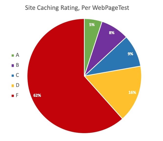
Typically, a person might think of images or user-facing content as being cached. But your site’s cache can cover all sorts of things, including back-end code.
However, most sites aren’t leveraging this to the fullest.
Effective caching speeds up load times, so having a good caching policy in place should only help with site speed!
41% had a bad First Contentful Paint (FCP) score
First Contentful Paint (FCP) is how long it takes the first visible item to show up on the page for a user – it could be the first text, image, etc. A great example is here from web.dev.
People are impatient and don’t like waiting around … having a visual confirmation the page is loading quickly helps avoid someone leaving your site before it even had a chance.
Two seconds is slow. One second is the threshold for good, and 41 sites were double that – 2 seconds or greater! (Remember, every small advantage adds up to higher chances of people becoming leads.)

Cumulative Layout Shift (CLS)
Have you ever had webpage load, only to have something move right as you’re about to click it? That’s what nobody wants, and it’s why CLS is a part of Google’s Core Web Vitals.
Reducing this creates a more uniform visual as the page loads, prevents possible annoyances, and only helps provide a happier experience! Spectrum had one of the more easily-spotted shifts on mobile, with its form.
54% of websites registered a CLS of greater than 0.25 seconds on WebPageTest, which is considered poor. Only 25% were “good” with a CLS of less than 0.1 seconds.
However, it’s worth noting that this is a metric that’s only recently come into the SEO spotlight for the industry at large, so it’s not surprising to see so many with a high CLS.
Other random observations
These didn’t fit into the other categories above, but if you’ve read this far then you’ll appreciate them!
Freddie Mac doesn’t have https.
A company with well over $15 billion in revenue – revolving around mortgages and a ton of personal data, mind you – didn’t have one of the most basic web security functions in place? (Seriously: It’s even been a Google ranking factor since 2014)
That’s a bit concerning!

Funky URLs
HP’s breadcrumb in Google search results caught my attention with its www8 at the beginning, though it didn’t appear to have any impact on results. Out of curiosity, I tried www7 and www6 but nothing came of it.
In addition, a few sites, such as Prudential’s, had non-SEO friendly URLs once they finished redirecting.

Using ASP.net = bad for SEO?
Only a few sites seemed to be using this, as identified by seeing .aspx files throughout their WebPageTest view. But all of them had poor ratings.
To be fair, it’s unclear from this testing if that’s simply correlation or causation. And it’s a question that’s been asked for many years. But for companies looking at long-term positioning, there are likely many more SEO-friendly options than ASP.net for your web services.
Thanks for the tip?
Finally, Northrop Grumman’s meta description was mildly amusing. I checked in multiple times on multiple days just to see if I’d get something different, and I didn’t.
(If you feel the need to tell your site visitors this, though … does it mean your site isn’t built to handle anything else?)

Conclusion
The saying “time is money” really does apply to digital marketing, and in hyper-competitive spaces, every little win you have over your competition helps.
That’s why I was surprised that overall, the Fortune 100 seemed to miss the mark with their site speed and technical optimizations. Granted – and this is admittedly a big caveat – I only looked at their digital doorstop, the homepage, and I suspect for at least some of these companies that isn’t as big a deal.
But for any website, your homepage is the digital introduction to your company. Get this wrong, and you’re leaving potential positives out of your first impression … and potential revenue heading back to Google’s search results.
So, ready to focus on improving your website? Here’s a few suggestions:
- Run a test on WebPageTest or Google’s Site Speed tools to get a feel for your own site
- Grab this Chrome extension that measures Core Web Vitals while you browse
- See what our digital advertising consulting can do for your website (and more) … or check out some of our other services and online training. Marketing is much more than a website!
- Ask us a question about this article, or any of your marketing challenges!
And if you want to see the data used for this blog, you can view it here. Thanks for reading!
